Netgear
Armor Security UX Redesign
#security
#mobile-app
#user-retention


Collaborators
Senior UX designer, Product Manager, Front-end developers, Third-party tech support team
Timeline
3 months of development; project delivered in Q1 2022
The problem
The cybersecurity product currently does not effectively communicate its value by an obstructive interface and confusing layering of information, causing high drop-out rate of subscription.
The solution
To clearly communicate the product's value through a redesigned interface with an effective visual hierarchy that highlights the benefits of Armor Security for its current users.
My responsibilities
Led UX design and UX prototyping. Worked on primary and secondary design research with UX researchers.
About Netgear and Armor Security
Netgear is a global networking company that provides a wide range of products, including routers, switches, and security solutions, designed to enable fast, reliable, and secure internet connectivity for both consumers and businesses.
Armor Security is a comprehensive cybersecurity solution integrated into its routers, providing advanced protection against malware, viruses, phishing, and other online threats for all connected devices in a home or small business network.


Netgear
Armor Security UX Redesign
#security
#mobile-app
#user-retention

Collaborators
Senior UX designer, Product Manager, Front-end developers, Third-party tech support team
Timeline
3 months of development; project delivered in Q1 2022
The problem
The cybersecurity product currently does not effectively communicate its value by an obstructive interface and confusing layering of information, causing high drop-out rate of subscription.
The solution
To clearly communicate the product's value through a redesigned interface with an effective visual hierarchy that highlights the benefits of Armor Security for its current users.
My responsibilities
Led UX design and UX prototyping. Worked on primary and secondary design research with UX researchers.
About Netgear and Armor Security
Netgear is a global networking company that provides a wide range of products, including routers, switches, and security solutions, designed to enable fast, reliable, and secure internet connectivity for both consumers and businesses.
Armor Security is a comprehensive cybersecurity solution integrated into its routers, providing advanced protection against malware, viruses, phishing, and other online threats for all connected devices in a home or small business network.

Opportunities
Finding out what stops users from learning about Armor's value
As reported by the product owners, users of Armor Security were not fully understanding the value of its features and were unsubscribing from the service. I took the initiative to conduct a UX audit of the current design and identified several key design opportunities for improvement.
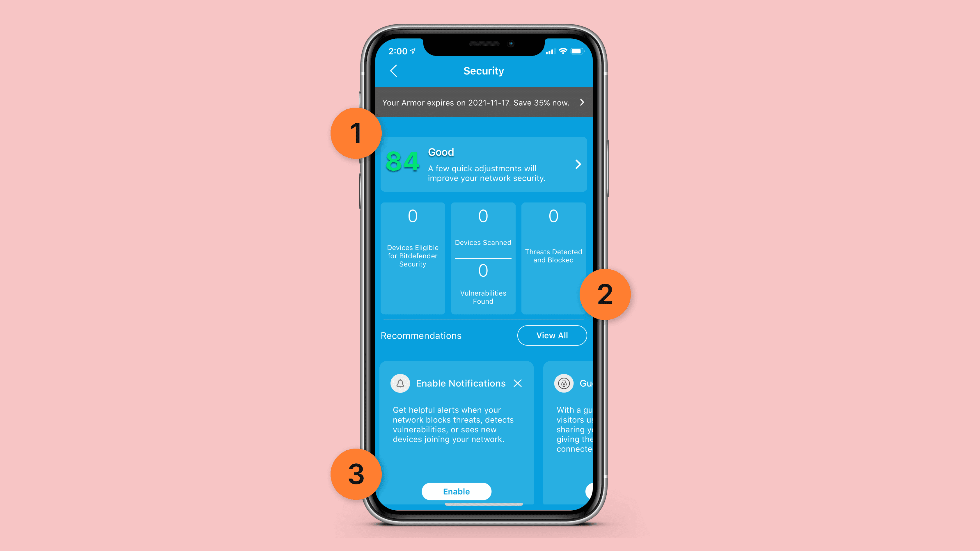


Design opportunity analysis for current design
Top design opportunities:
1
A simplified visual hierarchy to communicate important messages
The current design overwhelms users with excessive information, from irrelevant scores to promotional content. Optimizing the dashboard layout can significantly enhance communication effectiveness.
2
An effective way to convey outcomes using a clear language rather than numbers
What does a number mean? Does 70 mean high or low? Instead of presenting users with numbers lacking context, it's more beneficial to clearly explain what the feature has achieved in plain language.
3
An organized layout for information priority
Different users have different jobs-to-be-done. While most visit the page for live security briefings, additional content like educational materials can be organized into a secondary tab to improve space efficiency.
Opportunities
Finding out what stops users from learning about Armor's value
As reported by the product owners, users of Armor Security were not fully understanding the value of its features and were unsubscribing from the service. I took the initiative to conduct a UX audit of the current design and identified several key design opportunities for improvement.

Design opportunity analysis for current design
Top design opportunities:
1
A simplified visual hierarchy to communicate important messages
The current design overwhelms users with excessive information, from irrelevant scores to promotional content. Optimizing the dashboard layout can significantly enhance communication effectiveness.
2
An effective way to convey outcomes using a clear language rather than numbers
What does a number mean? Does 70 mean high or low? Instead of presenting users with numbers lacking context, it's more beneficial to clearly explain what the feature has achieved in plain language.
3
An organized layout for information priority
Different users have different jobs-to-be-done. While most visit the page for live security briefings, additional content like educational materials can be organized into a secondary tab to improve space efficiency.
Outcome
A logical and psychologically sound information architecture for the content
By simplifying the interface into functional priorities, I created a graph to illustrate an ideal model listing that serves as a guide for the upcoming UX design layout.
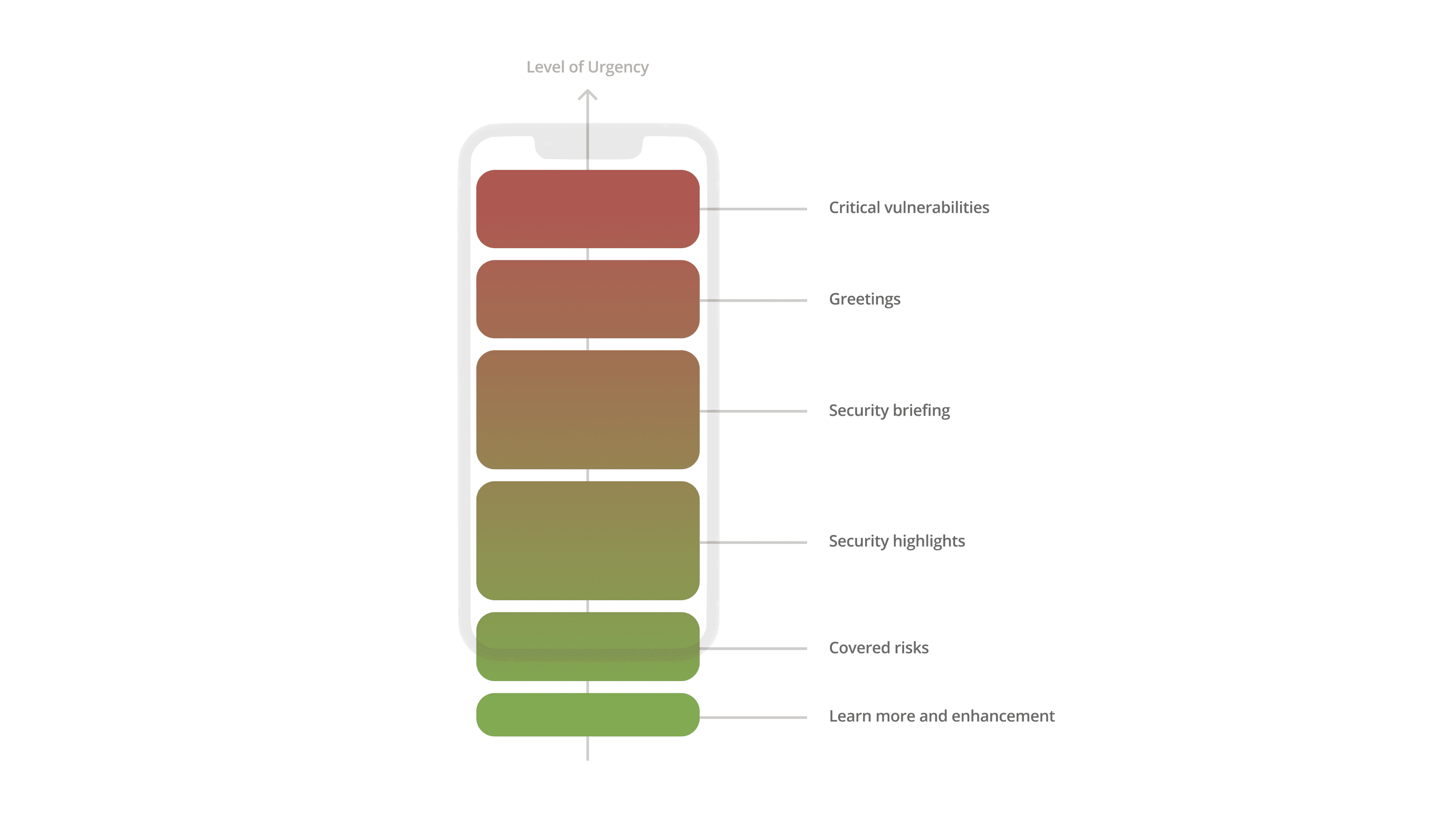


Visualization of priority based on level of urgency
Communicating the product's full potential using an optimized UX design
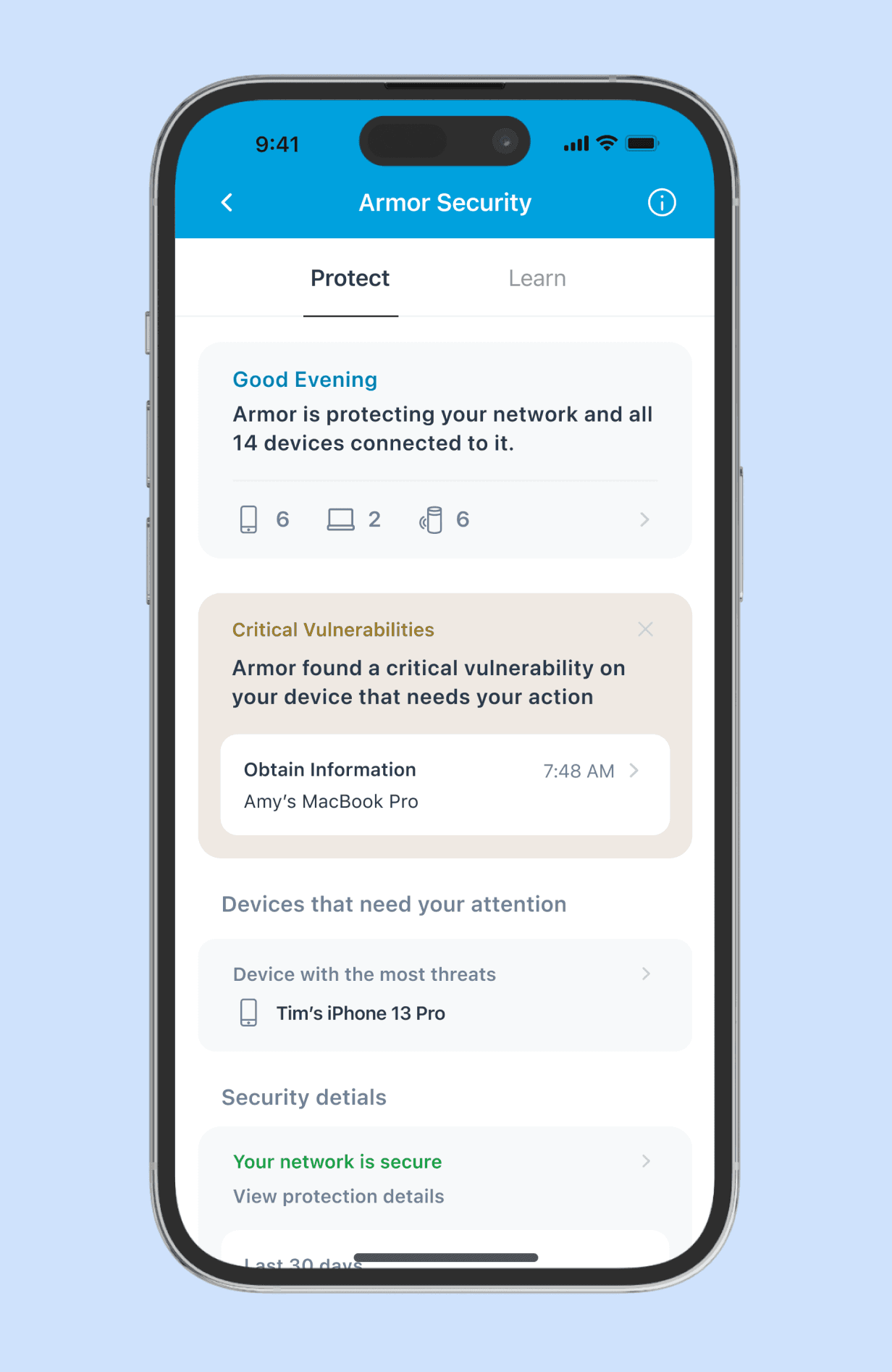
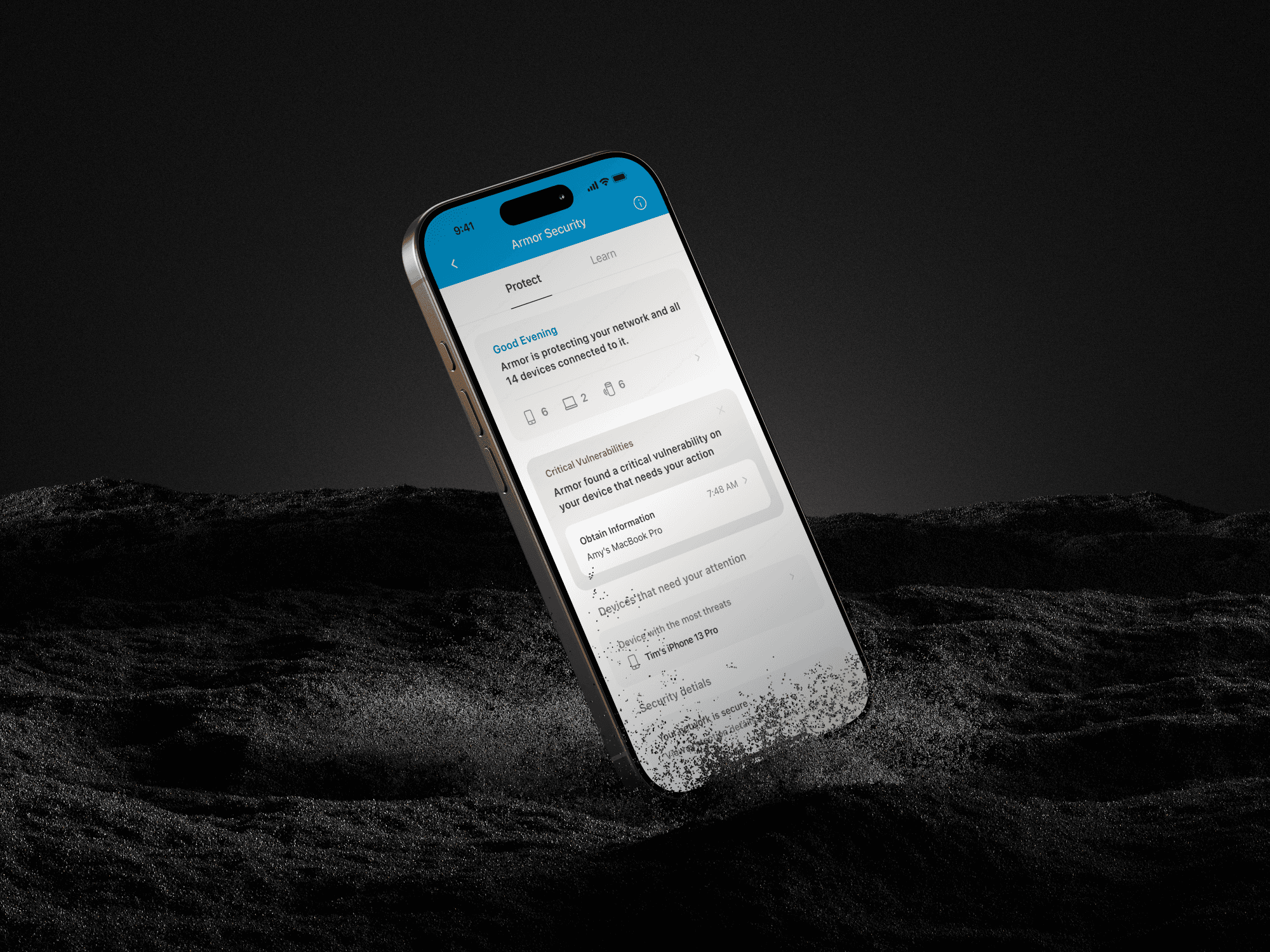
Based on the previous audit, three rounds of user interviews and testing, and several sprints of iteration, the final design addresses key opportunities and aims to effectively communicate the feature's full value to users.
Outcome
A logical and psychologically sound information architecture for the content
To gauge initial user perceptions of the top concepts, I led the creation of paper prototypes. The team collaboratively organized on-site testing and gathered feedback from eight participants on campus identified as potential users of wellness planners.

Visualization of priority based on level of urgency
Communicating the product's full potential using an optimized UX design
To gauge initial user perceptions of the top concepts, I led the creation of paper prototypes. The team collaboratively organized on-site testing and gathered feedback from eight participants on campus identified as potential users of wellness planners.
Conflict
Turning a potential trust crisis to a promising business opportunity
The project emerged from my commitment to user rights. Before proposing the UX redesign, I was asked to create a "fake door test" to gauge user sensitivity to pricing. This test involved displaying a splash screen like the one below, asking users if they would consider a promotion for a feature with fewer capabilities—despite the feature did not actually exist. The flow would conclude by thanking users for their feedback without further actions.
Recognizing the potential risk of damaging user trust in a product that was already losing users, I escalated my concerns to the design lead and suggested a comprehensive audit of the app. My intention was to identify the app's internal weaknesses before testing with real customers. My advocacy for user rights against business mischief ultimately helped establish the project and has the potential to restore user trust by encouraging them to re-engage with the service.
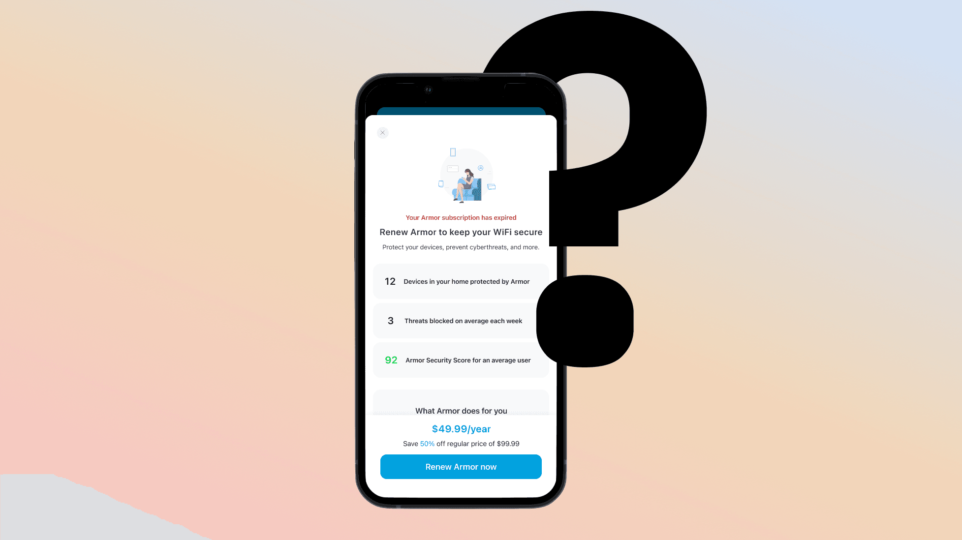


A questionable splash screen for the "fake door test"
Conflict
Turning a potential trust crisis to a promising business opportunity
The project emerged from my commitment to user rights. Before proposing the UX redesign, I was asked to create a "fake door test" to gauge user sensitivity to pricing. This test involved displaying a splash screen like the one below, asking users if they would consider a promotion for a feature with fewer capabilities—despite the feature did not actually exist. The flow would conclude by thanking users for their feedback without further actions.
Recognizing the potential risk of damaging user trust in a product that was already losing users, I escalated my concerns to the design lead and suggested a comprehensive audit of the app. My intention was to identify the app's internal weaknesses before testing with real customers. My advocacy for user rights against business mischief ultimately helped establish the project and has the potential to restore user trust by encouraging them to re-engage with the service.

A questionable splash screen for the "fake door test"
Conclusion
1
Happy users, happy business
Navigating the decision conflict deepened my understanding of users' perceptions of a feature, a product line, and even the brand itself because of design. My commitment to making more ethical design choices helped prevent a potential loss of user trust, ultimately saving the business significantly.
2
Understand user's mental model and provide them with what they care
A great UX design should ease users' experiences, not add to their burdens. Through multiple user interviews and understanding how they use the service, I gathered data points that guided me in making more user-centric design decisions.
3
Show the benefit to users, don't tell
Numbers can be straightforward, but they often fail to convey meaningful messages. By shifting the focus from numbers to short phrases, the new design adds a more human touch to the interaction, fostering greater user reliance and retention.
